Thank you!
Friday, April 7, 2017
Final Project
Well here it is. The final product. I would especially like to thank my friend Andrea for being my model in this magazine. I'm very proud of myself for what I have accomplished and I really do enjoy what I have created. I hope you do too.
Here is 'Bloom':
http://joom.ag/uqkW


Here is 'Bloom':
http://joom.ag/uqkW


XV - The End
Well. This is it. I finished it. This is my official last blog post before the postings of my CCR and final project. It's a bit surreal as well as bittersweet to finish with something like this because while it might have been a long stress filled journey, I'm sad to end it. This is the type of feeling I have on every last day so school. Happy it's over, sad to see it end. I am very proud of myself to have accomplished what I have done on my own and especially with the little to no experience with making something as major as this.
I am currently about to start the filming process for my CCR and once that is over, I will post everything as soon as possible.
This was definitely a journey, but nonetheless I'm proud of myself.
Thank you for reading through the journey of the creation of my magazine "Bloom"!
I am currently about to start the filming process for my CCR and once that is over, I will post everything as soon as possible.
This was definitely a journey, but nonetheless I'm proud of myself.
Thank you for reading through the journey of the creation of my magazine "Bloom"!
Thursday, April 6, 2017
XIV - Changes
I made a few changes to my cover image:


To describe my changes and why, I cropped the bottom portion of the image down to take away the unnecessary elements of the Wynwood flooring as well as changing the coverline. I did the change of the coverline because I felt as if it wasn't really getting the point across correctly of a spring edition magazine, so I rather just bluntly put on there "Spring Edition" and get straight to the point.
Also, I unfortunately took away the idea of the flower box because it wasn't really working out. Instead I did this:

I might add a few more items to it or might not, it all just mainly depends on when I finish typing the 2 page spread, which may I add is a lot harder than I thought.
Right now I'm currently in the zone of editing and although it may be difficult - I'm enjoying it a lot.
It's almost finished and I can't to show off the final project.
Monday, April 3, 2017
XIII - Updates!
Yesterday was a very productive day for me because I was able to do my cover page, table of contents, and half of my two page spread. I still have a few more images to capture but as of right now I'm on good time to finish and still have plenty of time to do my creative critical reflection (CCR). Unfortunately because I'm on a free trial for Indesign, I only have until Friday to completely finish editing and putting together my magazine. The time after that will be spent working on my CCR.
Moreover on my magazine, the cover line I currently have on my cover image shown in my previous post isn't for sure yet due to the fact that I'm not too sure on the color, font, or text (basically everything about it). I feel as if the cover line stands out more than the masthead which isn't necessarily something that I want. I realize this is mostly because the color of the masthead being too similar to the color of the background, but I feel like it is creating that color scheme that I'm going for.
Also, I realized that the route I decided to take for my table of contents isn't my original idea at all. I figure I'm not much of a planning person rather a person who knows what they're doing only as they're doing it.
To end this quick post on my updates, I'm actually really enjoying the production of this project (something I rarely say) and I hope my passion for it shows through my final product.
Sunday, April 2, 2017
XII- Cover Image!
I finally got some pictures taken for the cover image! It turns out almost all of the ideas I had originally planned for my cover page wasn't the route I took. Here's what the cover page looks like so far:

I chose a different font for the masthead than I originally planned for because I think this font is a lot more similar to the font used in other fashion/beauty magazines like Bazaar and Vogue.
I can't wait for the final product!!!
Friday, March 31, 2017
XI - Box of Flowers (part 2)
Hi! This is a quick post about updates and the ideas I have recently decided to use for my project.
So I took the idea from the prom proposal and put it to works and here's what it looks like:
 Although different in colors and quantity from the original one, I still feel like this will still create an ideal background for the theme I am attempting to represent. I also don't like how some of the wood is being shown underneath the flowers so I may add colored construction paper to it or purchase one more flower. As far as the two page layout, I have yet to finish typing it up. I realized it is really hard to write interesting yet somewhat informal descriptions on spring trends considering it's mostly image based. After the images are done, I feel like it will be much easier to compost my two page spread.
I decided not to use the flowers in the table of contents because that would definitely be overdoing it. I instead will attempt to create a more simple layout containing only a few images. In order to put together my magazine, I downloaded a free trial of InDesign. I am currently watching tutorials on how I can use it to the best of my ability and create something truly beautiful.
Tomorrow is the day! Tomorrow I go out and start photographing. I have a few ideas as to how I want to photograph the model, so hopefully all goes well!
It's is going to be a loooooooong day, but I am truly excited.
So I took the idea from the prom proposal and put it to works and here's what it looks like:

I decided not to use the flowers in the table of contents because that would definitely be overdoing it. I instead will attempt to create a more simple layout containing only a few images. In order to put together my magazine, I downloaded a free trial of InDesign. I am currently watching tutorials on how I can use it to the best of my ability and create something truly beautiful.
Tomorrow is the day! Tomorrow I go out and start photographing. I have a few ideas as to how I want to photograph the model, so hopefully all goes well!
It's is going to be a loooooooong day, but I am truly excited.
Thursday, March 30, 2017
X - Box of Flowers
On Tuesday we met in groups and I received a little bit of feedback on my table of contents. They suggested I add some items to it that have a relation to beauty or fashion, such as makeup products. I plan to start photographing the images for the table of contents sometime this week and will take these inputs into consideration.
This image inspired me to add a "Spring Favorites" page after the table of contents and include images of makeup that are in spring season. I plan to purchase a wooden box like the one shown as well as similar looking fake flowers. Inside the box, I will have the makeup and later add text stating what the makeup is called and the price/where to purchase it. Hopefully, I won't overdo the use of flowers, but if worst comes to worse the use of flowers on the table of contents will be removed, which I may think will be the case.
Some more (very good) news is the due date as been extended from April 9th to April 11th. Although only a 2 day extension, these 2 days will be very beneficial to me especially since I had a delay on the photography.
Citations:
@SoRelatable. Common Girl. Digital image. Twitter. N.p., 28 Mar. 2017. Web. 29 Mar. 2017.
In other news, I was scrolling through Twitter and believe it or not received inspiration for props that I can use from a picture of a prom proposal. Here it is:
 |
Some more (very good) news is the due date as been extended from April 9th to April 11th. Although only a 2 day extension, these 2 days will be very beneficial to me especially since I had a delay on the photography.
Citations:
@SoRelatable. Common Girl. Digital image. Twitter. N.p., 28 Mar. 2017. Web. 29 Mar. 2017.
Sunday, March 26, 2017
IX - 2 Weeks Left
As of today, there are only two weeks left until the final due date of this portfolio project. I decided today to start my focus on the two page spread. As mentioned (plenty of times) in my previous post, my two page spread will be on the "Fresh Spring Trends" (get it?). I will need to conduct some more research on what these trends are in order to construct my two page spread well.
For the layout, I saw this post Mrs. Stoklosa has pinned on Pinterst:
 Since I am doing a story on the season's fashion trends, I feel as if my layout will rely primarily on the images. So I decided on using one of two layouts, the top right and bottom right. I feel as if they put a lot of focus on the outfits being shown enabling the discussion surrounding the images. Once I gather my information I will be able to narrow it down to which layout will better suit my context.
My next post will be discussing the trends being mentioned in my two page layout. Now I'm getting serious.
Citations:
Daniellesdooodles, and Wordpress.com. Magazine Project Week 6. Digital image. Pinterest. N.p., 15 Oct. 2012. Web. 26 Mar. 2017.
For the layout, I saw this post Mrs. Stoklosa has pinned on Pinterst:

My next post will be discussing the trends being mentioned in my two page layout. Now I'm getting serious.
Citations:
Daniellesdooodles, and Wordpress.com. Magazine Project Week 6. Digital image. Pinterest. N.p., 15 Oct. 2012. Web. 26 Mar. 2017.
VIII - Ultra
Here I am typing up a post at 1:30 AM. How professional. Anyways, yesterday, the day I was meaning to go to Wynwood to start taking pictures for my magazine, was the first day of the music festival Ultra. Both of these locations are in Miami which means there would be a lot of traffic. Therefore I wasn't able to drive down there unless I wanted to wait in traffic for an hour. So I decided to move the photography portion of the project to next weekend.
My final decision on the topic of the magazine will be spring trends. No more debating for me! The other topics mentioned in my previous post will be part of the table of contents.
I also really want to have the magazine be a special edition exclusively for spring, so a lot of pictures will have a spring color scheme as well as really focused on flowers (I'll try not to overdo it)
I already started an example of how I want my cover page to be, with a little work being done to the coverline. I used Google Slides to make this to get an idea but it won't be used for the actual project:
I really like using the font Oswald because I feel like it has a really simple and sophisticated look to it. I took the inspiration from the Bazaar cover pages I showed in my previous post and tried to keep the text as simple as possible yet pleasing.
I saw in majority of the fashion/beauty magazines that the masthead is always in a big, simple font on top of the cover page, which is shown in my template of my page.
I also put my thoughts of table of contents into an image and here it is:

My final decision on the topic of the magazine will be spring trends. No more debating for me! The other topics mentioned in my previous post will be part of the table of contents.
I also really want to have the magazine be a special edition exclusively for spring, so a lot of pictures will have a spring color scheme as well as really focused on flowers (I'll try not to overdo it)
I already started an example of how I want my cover page to be, with a little work being done to the coverline. I used Google Slides to make this to get an idea but it won't be used for the actual project:
 |
| Gigi Hadid and Jourdan Dunn obviously are not be my models for the cover page, but this image really exemplifies how I would like to capture mine. |
I saw in majority of the fashion/beauty magazines that the masthead is always in a big, simple font on top of the cover page, which is shown in my template of my page.
I also put my thoughts of table of contents into an image and here it is:

I only showed a little of how I wanted it to look, and after a little work being done and using my own images I feel like I might be able to make it work.
Hopefully next weekend no huge, overpopulated, tourist attracting music festivals will be going on and I am able to go to Miami to start the photography process!
Citations:
LiliGraphie. Beautiful Single Flower Head of Pink Ranunculus, Stock Photo. Digital image. Colourbox. N.p., n.d. Web. 26 Mar. 2017.
Kovalchuk, Igor. Single Flower Gerbera Isolated on the White Background, Stock Photo. Digital image. Colourbox. N.p., n.d. Web. 26 Mar. 2017.
@onlythemodels. Gigi Hadid & Jourdan Dunn • #maybelline100 Event. Digital image. Scoopnest. N.p., n.d. Web. 26 Mar. 2017.
Friday, March 24, 2017
VII - Topics
After talking with Mrs. Stoklosa, I realized that I was limiting myself to very few options for my two page spread when really I have a whole variety of topics to do. I decided to look a little more at some inspiration and found an article on leaf.tv that lists some ideas about beauty/fashion topics for a magazine. I underlined the ones that interest me the most:
Health:
The topic that's primarily featured in beauty magazines. Health issues usually discuss topics such as:
Health:
The topic that's primarily featured in beauty magazines. Health issues usually discuss topics such as:
- Exercise routines
- Skin care products
- Grooming products
- Health problems
Makeup:
- Tips and techniques on how to apply makeup
- What colors will compliment an outfit
- New products to help women look their best
- Input from readers about their favorite products
Seasonal Fashion:
- Entice readers to buy a particular brand/trend
- Current season fashions
- Accessories that made a season comeback
- How to piece an outfit together for a special occasion
Celebrity Fashion:
- Special event reviews
- Celebrity "secrets" on how they maintain their appearances
I'm narrowing it down to the few that are underlined but still not ruling out the interview. Hopefully this will be figured out really soon.
Citations:
Meave, Anya. "Fashion and Beauty Magazine Topics." LEAFtv. N.p., 12 May 2011. Web. 23 Mar. 2017.
Citations:
Meave, Anya. "Fashion and Beauty Magazine Topics." LEAFtv. N.p., 12 May 2011. Web. 23 Mar. 2017.
Sunday, March 19, 2017
VI - Stumped
So today I was REALLY busy and was unable to put much thought into the planning of my magazine and I'm getting a little worried. I decided I will not be emailing the designer due to the fact that my idea of my model wearing the clothes made by the designer won't work out, therefore my cover image will not have any correlation to my cover story. Also I wasn't too sure on how to email the designer anyways. So now I'm back to thinking about any other possible ideas for a cover story and sadly, I am stumped.
I'm starting to look at writing about the "hottest trends of spring 2017" (cliche, I know) but I feel like I can make this work. I'm taking a look on Elle's website to take a look at the current trends and I feel like this may work. These trends included:
I'm starting to look at writing about the "hottest trends of spring 2017" (cliche, I know) but I feel like I can make this work. I'm taking a look on Elle's website to take a look at the current trends and I feel like this may work. These trends included:
- Seaside stripes
- Khaki
- "50 shades of yellow"
- Banker stripes
- Single shoulder cut
- Flashdance shoulder
- Sleeve slits
- White shirt dress
- Waist-cinchers (why??)
- Foldover waists
- Trench coat
- Boyscout sash
- Robes (?)
I feel like I will be able to utilize this list of trends and form a very good cover image and two page spread. It's getting REAL now and already plan to start taking the pictures on Friday and putting everything together over this long weekend coming up (with no spring break to follow, sadly). More thought will be put into this throughout the week, and this time I'm getting serious.
Citations:
Ogunnaike, Nikki, and Justine Carreon. "The Top Trends From Spring 2017 New York Fashion Week." ELLE. N.p., 13 Feb. 2017. Web. 19 Mar. 2017.
Saturday, March 18, 2017
V - Brainstorming
Well today in class while doing some intensive research and looking at some more blog examples on a mini iPad (I really miss my laptop) I realized something. I DON'T HAVE A SET PLAN! Mrs. Stoklosa warned us today about not having much time and at first I brushed it off, cause after all I am a high school student and have the almost automatic thought of "of course there's enough time" but I have learned that there really is not, SO let's do some brainstorming:
I'm still pretty set on using the fence with plastic flowers in Wynwood for the background of my cover page and as of right now the title of my magazine is still "Bloom", but honestly I'm not too sure about it anymore because I feel like it might be too similar to Bloomberg (do people shorten Bloomberg to Bloom??) so that also is being thrown into my bubble of thoughts.
I was looking at some blog samples and one blog in particular gave me the idea to interview an upcoming fashion designer. So my initial thought was who?? Who would be willing to take time out of their presumably busy day to talk to a high school student about a school project? Well let's find out. I'm not really sure how to find someone of the sorts but it doesn't hurt to do some research.
I found on TeenVogue, list that names some upcoming fashion designers and one in particular stood out to me, Sandy Liang. What I was originally hoping to do was purchase some articles of clothing from her brand and allow for the person I'm using as my model to wear the clothing, but unfortunetly Sandy Liange's clothing is over $100 and probably won't arrive on time. So that's out of the picture. I'll try to still email Liang sometime tomorrow and ask if I can ask a few questions. I'm a little confused on how to email such a person, but we'll hope for the best!
Citations:
Plummer, Todd. "The 7 Coolest Designers You Need to Know Now." Teen Vogue. TeenVogue.com, 16 Feb. 2016. Web. 18 Mar. 2017.
"Sandy Liang." SANDY LIANG. N.p., n.d. Web. 18 Mar. 2017.
Thursday, March 16, 2017
IV - Bloom
I think I may have came up for a name for my magazine - "Bloom".
I chose this name because according to Her Family a study revealed that 14% of young women are unhappy with their lives, and 34% say they are unhappy with their appearance. Through the use of social media such as Twitter (as shown here), I learned that as a result of this many young women will turn to the use of makeup and develop a sense of a unique fashion in order to allow themselves to find their own sense of beauty. This where the name "Bloom" comes in. Since Bloom will be a fashion/beauty magazine, it provides information to young women interested in meeting their fashion/beauty needs. In a sense, they're "blooming" into what they want and becoming happy, whether it's through the use makeup or fashion. This is only the beginning so that name is subject to change.
Now as far as production, I have already decided many pictures will be taken at Wynwood in Miami because of the artistic backgrounds I am able to capture in this area. Also, there is a section in Wynwood that I think will do well as my cover page because it is a fence with plastic flowers on it which can pertain to the idea of "Bloom". I found a picture of the fence from Pinterest and here is what the area looks like:

I also have decided that because I chose this fence with plastic flowers as my cover page background, the issue of my magazine will be a spring issue with a color scheme of pastel pinks, purples, yellows, and blues.
I am soon to start the actual layout of the magazine in which I draw the placement of the different components of the magazine on the cover page, table of contents, and 2 page spread.
This is the exciting part, and it's only getting better. I can see Bloom and all its glory now, and I love it.
Citations:
Jensen-Burke, Trine. "Young Girls Are Becoming More Unhappy Study Finds." HerFamily.ie. HerFamily, 01 Sept. 2016. Web. 16 Mar. 2017.
Makeup . "Makeup💋 (@Makeup)." Twitter. Twitter, 15 Mar. 2017. Web. 16 Mar. 2017.
Johnson, Debby. "Miami Street Art- Wynwood Arts District." Pinterest. N.p., 08 Jan. 2014. Web. 16 Mar. 2017.
Sunday, March 12, 2017
III - Inside Details
I decided today I will be looking at some examples of table of contents and two page spreads to start to prepare myself in the designing of my magazine, just so I have an idea of what I will be working with. Before I start to plan my magazine spread, I really enjoy taking some inspiration from other magazines in order to better prepare myself.
Here are some table of contents I found appealing:


The one from Bazaar is my favorite (obviously) because of the lack of words and descriptions that come from the Vogue and Cosmopolitan.
Bazaar tends to place their table on contents around a closeup image of an object pertaining to fashion, as also seen with this one:
Now for the two page spread here are the ones I found:

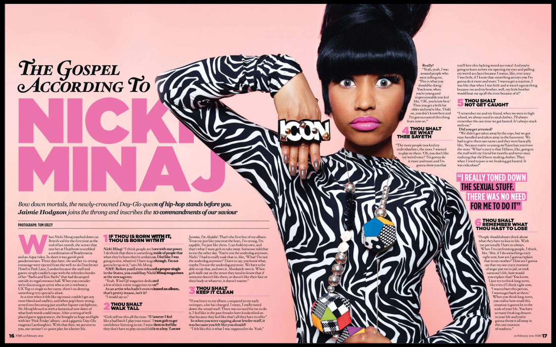
The first spread is from Grazia and well to be honest I don't know which magazine the Nicki Minaj spread is from, but I found it here. I was unable to find a two page spread from either of the magazines that I had for table of contents, but I really do enjoy the ones found from the other magazines. The main image really pulls a focus to the article and gives the idea that this article will not be a bore.
I am currently starting the planning process soon (still thinking of a name) although I have been giving lots of thought to my magazine already. I hope everything is going to go as planned (in my head).
Here are some table of contents I found appealing:


Bazaar tends to place their table on contents around a closeup image of an object pertaining to fashion, as also seen with this one:
 |
| This one although does not show a lack of words and descriptions. |


I am currently starting the planning process soon (still thinking of a name) although I have been giving lots of thought to my magazine already. I hope everything is going to go as planned (in my head).
Saturday, March 11, 2017
II - Feeling Inspired
In relation to my previous post, the result of my laptop crashing was insane slowness. I'm currently working on my desktop but the issues with my laptop will prove to be problematic when bringing it to school and when I start to put the magazine together. Ugh. Hopefully this will all be resolved in time for me to start the designing process.
Now let's talk about the fun part - research.
As previously mentioned, Harper's Bazaar is more than likely to be my inspiration for this project, sort of like my case study. I found on Tune Groover that Bazaar was #15 out of 20 "top selling fashion magazines" but hey, at least it made the list. I learned that Bazaar was created in 1867 and while once a weekly magazine, it became monthly in 1901. It's target audience are sophisticated and upper-class women interested in fashion. In my magazine this portion will be different due to the models I will be using (again, I'm using my 17-year-old friends so debate all you want how sophisticated they may be). Bazaar sold 734,504 magazines just in the first half of 2013.

I found an article on Bazaar's website titled "Rihanna Takes Flight" and WOW! This was a cover story for Bazaar's 150th Anniversary inspired by Amelia Earhart. Here's the cover image:


Allard, Greg. "The Top 20 Selling Fashion Magazines." TUNE GROOVER. N.p., 03 Oct. 2015. Web. 11 Mar. 2017.
Photographs by Mariano Vivanco; Fashion Editor: Mel Ottenberg. "Rihanna Takes Flight." Harper's BAZAAR. N.p., 02 Mar. 2017. Web. 11 Mar. 2017.
Now let's talk about the fun part - research.
As previously mentioned, Harper's Bazaar is more than likely to be my inspiration for this project, sort of like my case study. I found on Tune Groover that Bazaar was #15 out of 20 "top selling fashion magazines" but hey, at least it made the list. I learned that Bazaar was created in 1867 and while once a weekly magazine, it became monthly in 1901. It's target audience are sophisticated and upper-class women interested in fashion. In my magazine this portion will be different due to the models I will be using (again, I'm using my 17-year-old friends so debate all you want how sophisticated they may be). Bazaar sold 734,504 magazines just in the first half of 2013.

I found an article on Bazaar's website titled "Rihanna Takes Flight" and WOW! This was a cover story for Bazaar's 150th Anniversary inspired by Amelia Earhart. Here's the cover image:

The photos from the shoot were absolutely gorgeous as well as giving me a little more idea as to what my layout stories could be about. Using a inspirational historical woman figure and recreating that idea was an amazing idea for Bazaar to do. Here are some of the images from the shoot:


I love love love the colors and editing done to these photos. Definitely moving closer and closer to the imagination of an amazing magazine.
I can't wait!!!
Citations:
Allard, Greg. "The Top 20 Selling Fashion Magazines." TUNE GROOVER. N.p., 03 Oct. 2015. Web. 11 Mar. 2017.
Photographs by Mariano Vivanco; Fashion Editor: Mel Ottenberg. "Rihanna Takes Flight." Harper's BAZAAR. N.p., 02 Mar. 2017. Web. 11 Mar. 2017.
Thursday, March 9, 2017
I - The First Step
This is the first step in the journey to the creation of my magazine. :)
I am very excited to get started!!
So first things first - a genre.
I almost instantly decided on doing a women's beauty/fashion magazine. I believe I will be able to put my skills to the true test when doing this genre of magazine, plus I really enjoy the simple yet pleasing visuals many beauty magazines tend to portray.
After browsing Pinterest, I found some interesting covers from Vogue and Bazaar, which made me realize that I LOVE the covers they produce. Everything about majority of their covers is so visually pleasing! Here's what I found:
 The color scheme of red white and blue is my favorite part of this cover. Although the magazine is not as simple as I would hope mine to be, definitely an inspiration on how to work with color.

Honestly, I didn't even know Bazaar existed until I started conducting my research. Shameful. I know. But thankfully I sure do now!! This cover page is beautiful!! The light pink blending softly into the baby blue sea with Jennifer Aniston standing directly in the middle works SO well. A lot more simple than the Vogue magazine, and yet another color scheme...I will definitely taking most of my inspiration from Bazaar.

I mean WOW! Talk about blue! The blues all work very nice together and the exciting expression on Sarah Jessica Parker's face as she's running down a bridge in a big Cinderella looking dress really adds to the unique and enticing aspects of this cover.
The absence of cover lines on both of Bazaar's covers is what gives the magazine it's simplistic look as well as having the reader's attention focus primarily on the image.
I also noticed that the font used for the masthead on both magazines look almost identical to each other. Maybe my masthead will be a variation of that font since my goal is a simple yet unique magazine cover.
I did a little research on Bazaar's audience and learned on Hearst that it's male to female ratio of people who view their magazine is 37/64 with 42% of those people ranging in ages from 18-49, which are the demographics that are more than likely to match my target audience. Maybe with a younger age range considering the fact that my models will most likely be 17-year-old teens wearing clothes that are typically worn by people of the same age group.
This process will be very exciting(as well as stressful and challenging) and I can not wait to see what the final product will be!
P.S.: I already encountered my first issue while writing this post; my computer totally crashed on me and wouldn't work until two hours later. Hopefully this was just a one time thing because it may put some major drawbacks on this project.
Citations:
"Pinterest." Pinterest. N.p., n.d. Web. 07 Mar. 2017.
"Audience & Demographics." Hearst. N.p., n.d. Web. 07 Mar. 2017.
I am very excited to get started!!
So first things first - a genre.
I almost instantly decided on doing a women's beauty/fashion magazine. I believe I will be able to put my skills to the true test when doing this genre of magazine, plus I really enjoy the simple yet pleasing visuals many beauty magazines tend to portray.
After browsing Pinterest, I found some interesting covers from Vogue and Bazaar, which made me realize that I LOVE the covers they produce. Everything about majority of their covers is so visually pleasing! Here's what I found:
Honestly, I didn't even know Bazaar existed until I started conducting my research. Shameful. I know. But thankfully I sure do now!! This cover page is beautiful!! The light pink blending softly into the baby blue sea with Jennifer Aniston standing directly in the middle works SO well. A lot more simple than the Vogue magazine, and yet another color scheme...I will definitely taking most of my inspiration from Bazaar.
I mean WOW! Talk about blue! The blues all work very nice together and the exciting expression on Sarah Jessica Parker's face as she's running down a bridge in a big Cinderella looking dress really adds to the unique and enticing aspects of this cover.
The absence of cover lines on both of Bazaar's covers is what gives the magazine it's simplistic look as well as having the reader's attention focus primarily on the image.
I also noticed that the font used for the masthead on both magazines look almost identical to each other. Maybe my masthead will be a variation of that font since my goal is a simple yet unique magazine cover.
I did a little research on Bazaar's audience and learned on Hearst that it's male to female ratio of people who view their magazine is 37/64 with 42% of those people ranging in ages from 18-49, which are the demographics that are more than likely to match my target audience. Maybe with a younger age range considering the fact that my models will most likely be 17-year-old teens wearing clothes that are typically worn by people of the same age group.
This process will be very exciting
P.S.: I already encountered my first issue while writing this post; my computer totally crashed on me and wouldn't work until two hours later. Hopefully this was just a one time thing because it may put some major drawbacks on this project.
Citations:
"Pinterest." Pinterest. N.p., n.d. Web. 07 Mar. 2017.
"Audience & Demographics." Hearst. N.p., n.d. Web. 07 Mar. 2017.
Subscribe to:
Posts (Atom)